REIMAGINING AND OPTIMISING THE DESIGN FOR XELERON COCKPIT'S PORTFOLIO MANAGEMENT TOOL

Product design
UX` design
UX strategy
B2B Enterprise software
Overview
Xeleron Cockpit, a startup with a tested MVP, recognized the need to enhance product experience and unify the user journey as their customer base expanded.
I led cross functional teams to brainstorm and formulate solutions that suit our needs. Collaborated with produt managers, business units, and engineering teams to develop practical and scalable design solutions. Which led to the following impact.
43% decrease in rage clicks with the updated designs.
18% Decrease in error rates since the new design launch.
03+ New onboarded clients with successful onboarding on the tool.


Discovery and research
The UX audit of the existing tool uncovered several critical challenges that were deeply embedded within the product experience. Many of these issues had gone unnoticed over time, largely because users had adapted to the tool’s limitations.
However, this familiarity also meant that any redesign or improvement would represent a significant shift. Introducing changes required a thoughtful approach to ensure that enhancements improved usability without disrupting the workflows of long-time users.
lack of essential information, missing breadcrumbs, and page titles
Unclear information hierarchy
Component inconsistencies
The guidelines for component usage were missing, which acted like a breeding ground for inconsistancy
Dead ends
We found multiple flows leading to a dead end with now way for a user to return back
UX pattern inconsistencies
across multiple actions and flows. The same journey contained multiple patterns for the same processes.
KEY AUDIT INSIGHTS
Audit screenshots @xelerocockpit
Our job was not to just follow the tasks but instead to listen in between the tasks.
40+
Interviews and usability testing sessions
10+
Working sessions with differenet stakeholders
We conducted over in-depth sessions with program managers, engineers, scrum masters, and senior executives. These conversations often went beyond standard interviews, revealing deep user frustration and creative workarounds. Many participants shared that they maintained parallel Excel systems due to a lack of trust in the platform. One user described their experience as "searching for a needle in a haystack, while the haystack is on fire"—a vivid reflection of the cognitive load the tool imposed.
End to end product workflow

Phase 1 - Discovery
Xeleron cockpit 2022
User journey map

Phase 1 - Discovery
Xeleron cockpit 2022
Reflection
PERSONAS
Portfolio Users
Product managers, team leads, designers, and engineers
Portfolio Manager
Directors, key leaders
Admin
IT Operations teams, portfolio owners, Directors
Reflecting on our process, we started by immersing ourselves in the tool to understand its depth and the complexity of its user journeys. Defining specialised personas helped us uncover user priorities and pinpoint the most frequent tasks, laying the groundwork for a more intuitive information hierarchy. With these insights, we mapped role-based workflows to ensure the user experience aligned with real-world usage and expectations.
APPROACH
Understand the user flow
First, we concentrated on gaining an in-depth understanding of the tool and its functions.
Define hierarchy
We needed to understand user priorities and identify the most common tasks they would perform in the tool to lay a strong foundation for information hierarchy in the tool
Map key flows
After that we detailed key flows to map the user journey while performing various actions

Setting a foundation for a scalable future.
To lay a strong foundation for the tool, we focused on establishing clear semantics, intuitive affordances, and behavior design patterns that align with how users naturally think and act. Every interaction was crafted to reduce cognitive load and support decision-making at a glance. By grounding the experience in meaningful hierarchies and mental models, we ensured that the interface not only looked clean but also felt purposeful, predictable, and scalable for complex workflows.

Navigation and layout design explorations
Phase 2 - Ideation
Xeleron cockpit 2022

Journey Map - Low fidelity wires
Phase 2 - Ideation
Xeleron cockpit 2022
Frozen designs: High fidelity screens
Phase 3 - Execution
Xeleron cockpit 2022
Final Designs: Key user flows
#Dashboard
Capabilities
Dashboard is one of the most used functions of the tool as it facilitates managing workitems and tracking them across different phases.
Create and manage phases
Users could track and manage their workitems (epics and features) across each phase. The dashboard supports moving the work items from one phase to another.
Manage and track items concerning each phase
As each phase is configured based on the business needs , the dashboard allows users to track information across each phases and across the parent strategic goal.
#Dasboard final design
#Workitem anatomy


RoadMap
An essential feature to perceive complex pieces of information with ease, while navigating and tracking the organization's progress across hundreds of teams.
Frozen designs: High fidelity screens - Roadmap


Capabilities
Manage/Track PIs
Users could track and manage their workitems (epics and features) across each phase. The dashboard supports moving the work items from one phase to another.
Manage portfolio level milestones and work items
As each phase is configured based on the business needs , the dashboard allows users to track information across each phases and across the parent strategic goal.
Create Dependencies for each blocked item
Phase 3 - Execution
Xeleron cockpit 2022
Prioritization
The tools USP that enables organizations to prioritize their work based on standard and custom formula. This screen
Capabilities
Prioritise items and Goals
Capability to prioritize countless work items.
Auto Calculation
Prioritization enables organizations to auto-calculate their work item priorities based on their custom formulas
Adding items to the roadmap
Based on the priorities, users can add their epics and features to roadmap directly from prioritization.


The tools USP was the capability to help users prioritize their work item by ranking them based on predefined(but customizable) formula in the tool.
An option to add the linked workitems to the Roadmap directly from prioritization screen was a big help for the users
Nobody likes a horizontal scroll, to give user more control over the horizontal space we put collapsable table columns in place.
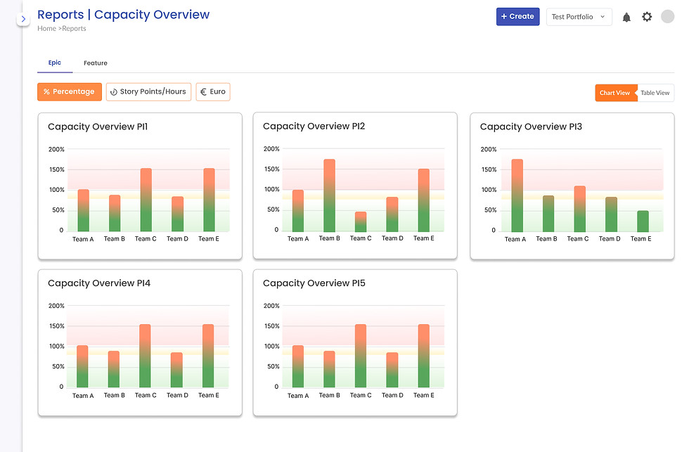
Other snapshots And visualizations
Showcasing additional finalised designs and interface directions created throughout the process. These screens reflect iterative thinking, evolving interaction patterns, and alternative layouts that informed key decisions. Each screen represents a moment of inquiry,testing visual hierarchy, refining microinteractions, and evaluating affordances in context.